


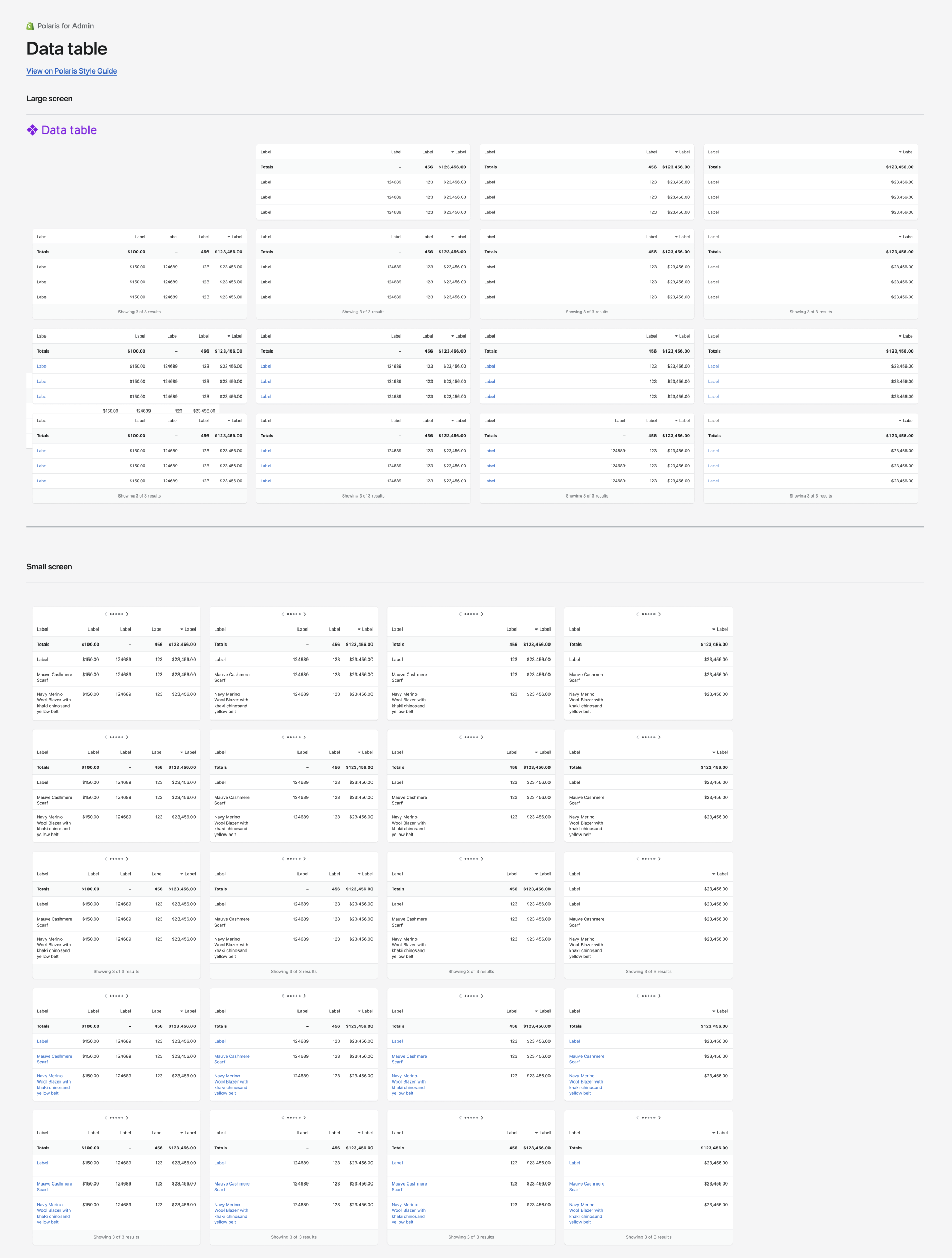
Table interfaces are crucial to the design of ecommerce SaaS technology. They organize information in a scannable fashion and help users quickly find what they are looking for quickly.
When starting in my current role, I used Shopify’s design system, Polaris. Polaris had an abundance of tables to choose from with different states, however I found it limiting and frustrating to use as a designer. I set out to find a better solution, but after an exhaustive hunt, I couldn’t find anything that would work for our design process. We needed it to be flexible and scale so we can move quickly....we're a startup after all....so I set out to create my own.
" I couldn’t find anything that would work for our design process. …so I set out to create my own."
Creating a table system in Figma
If you think about a table, there’s multiple rows, and columns and a header row. Bulk actions, drop downs, thumbnails, buttons and more. One change in a column, and you want that change to apply EVERYWHERE. They seem so easy, think excel or google sheets, however, tables in Figma are complex. But here’s an inside look on a system that has served myself and my team well for years now to make the complex, simple:
Prefer to watch instead of read? Scroll to the bottom!
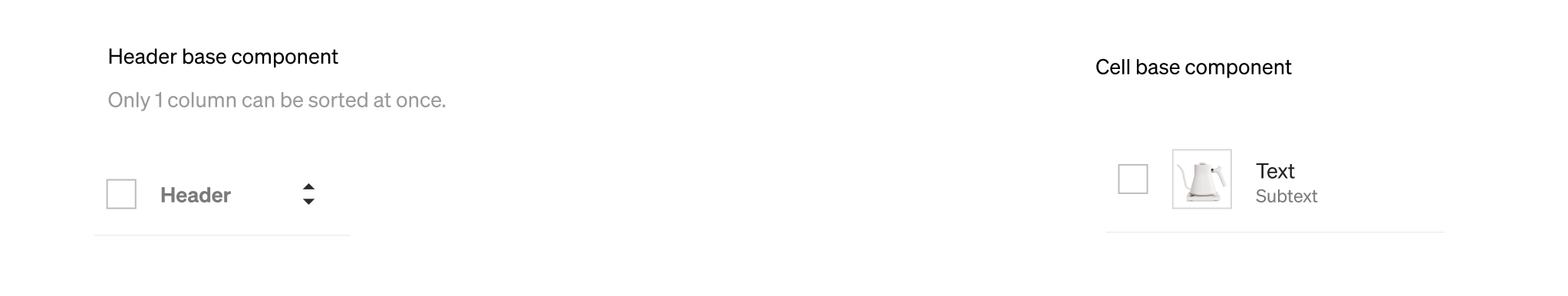
Step 1: Set up the base components
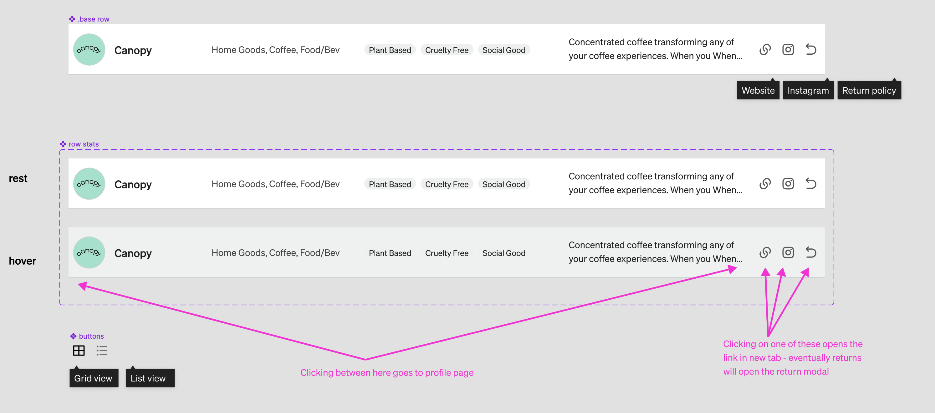
I started by mapping out the main base components of the tables. One for the header and one for the rows. These two base components house EVERY possible variation that exists. Why? So that if I make a spacing change, color change, or whatever it is….it will change everywhere!
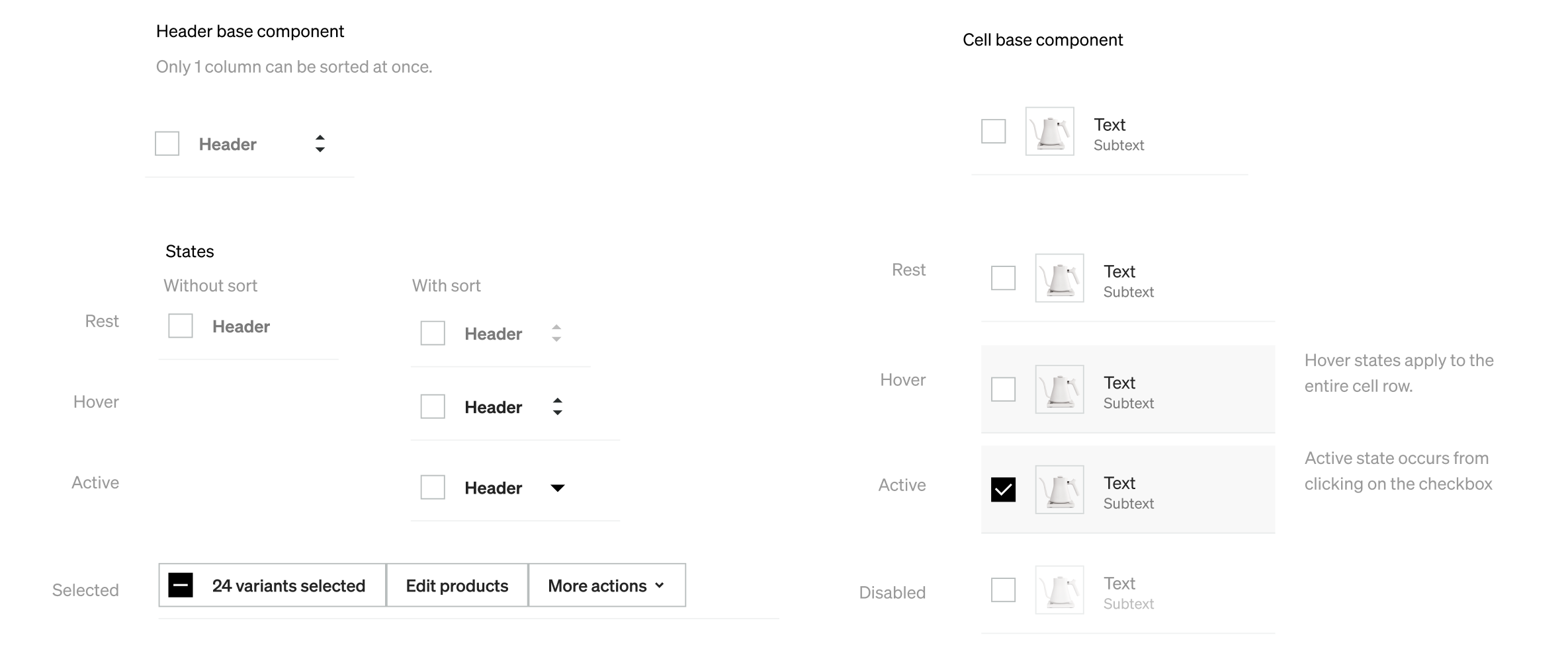
Step 2: Establish the state base components
After designing the base components, I designed the rest, hover, active and disabled states. This would then trickle into the many variants that we build next
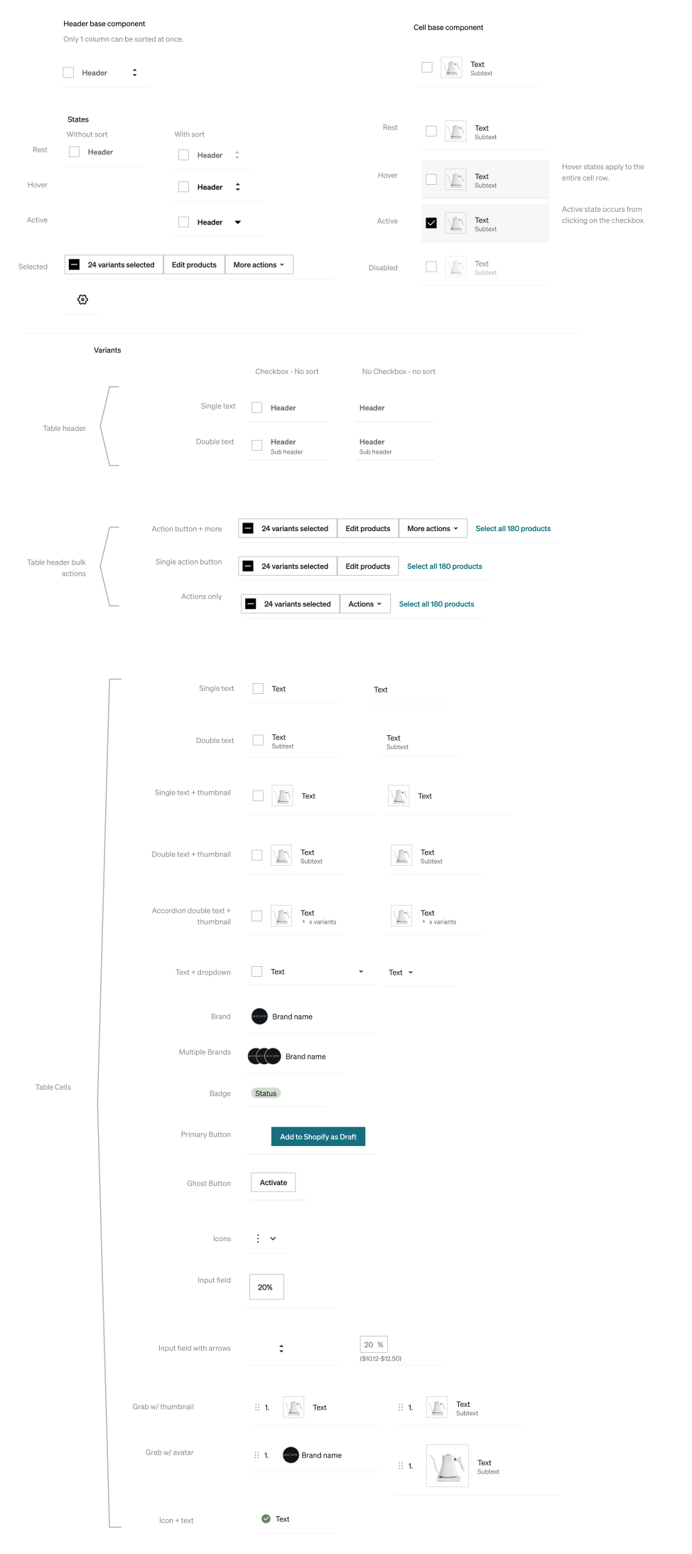
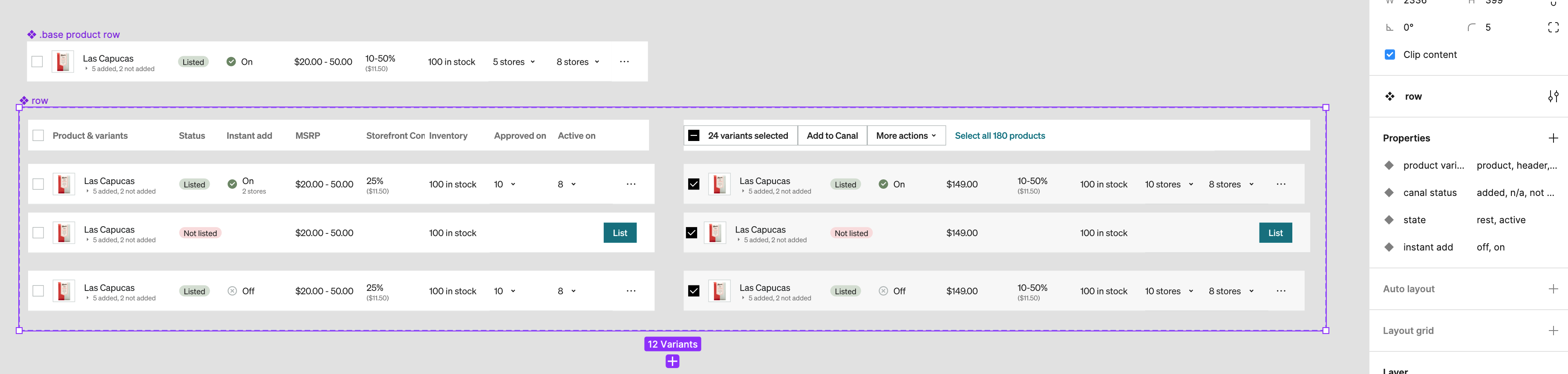
Step 3: Create all the variations and name them
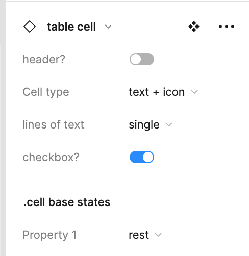
The variations are the key to the flexibility this system has to offer. They're preset so that it's quick and easy to choose the necessary cell type.
Step 4: Work with FE to implement
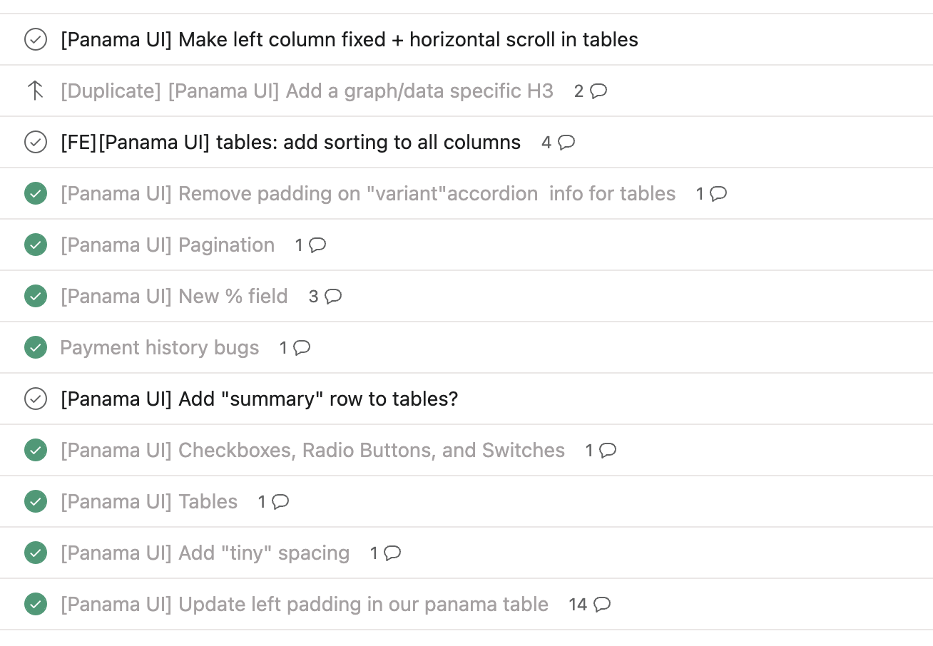
Our front end team built on top of a react library - they built the spacing and row cells to match the established design system. We like to use an asana board to track any adds or changes.
Step 5: Start using and refine
When I began using this system, it took a lot of practice. The first few times, it honestly didn’t help me that much. But as I continued to use it, test it, and refine it to fit our needs, it has been a game changer. Here’s what I do:
- Choose what the columns are, apply auto-layout (0px spacing), set all the cells to “fill container” (you can set a few to fixed if you’d like, but make sure to have at least 1 set to fill container.)…Make this into a .base component
- Take your .base component, duplicate it, and create a NEW variant, name it “Rows” or something without “.base”
- Add variants to this component. The one you created can be the “header” row. Now create all the variations of “rows” that you may need.
- Show the hover & active states of these rows, so that when you prototype, you can easily use these pre-existing components.
Step 6: Train other designers
Once I figured out the system and how best to use this in our design process, I trained junior designers. We found it was not as intuitive as I was used to, but it really just takes practice. I recorded a loom so that junior designers can follow and reference. This was really helpful and the designer on my team loved it and even said “You could be a Figma YouTuber”.
Step 7: Keep improving!
A few weeks ago, I made some updates to this system to allow for nested instances - yippee! This made it easier to access the states associated with the cells (hover, active, etc)
And that’s it!
Though, this took a ton of planning, focus and brain power, in the end this has saved me SO much time designing, prototyping, iterating and testing. Here's a video recap of how it's done, it's probably easier to follow :) Watch it in action:

